Use Case
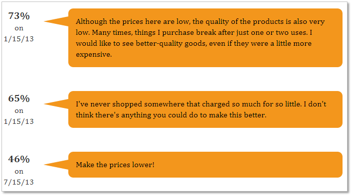
The client would like to see customer comments for customers who were unsatisfied or very unsatisfied with their overall store experience.
Report
Code
{|SHOWIF|OUTPUT_MODE=|EVALCONST(KNICKERS_OUTPUT_STANDARD)|}{DATATYPES.CONTROLS_START}
{DATATYPES.DEFAULT_DATE_FILTERS}
{DATATYPES.CONTROLS_END}{/|SHOWIF|}
<div class='results'>
{|VANISHIF|COUNT(DATATYPES.SHOW_DATATYPE)}
<div class='ui-state-highlight no-data'><p>No data was found to display</p></div>
{/|VANISHIF|}
{|SHOWIF|COUNT(DATATYPES.SHOW_DATATYPE)}
#filter only shops with 'unsatisfied' or 'very unsatisfied' responses
{|RESULT|FILTER=CLIENT_55_SURVEY_1238_QUESTION_71_ID|gte|4}
{|LOOP|RESULT.DATAPOINTS(SORT=TRENDING_TIMESTAMP)}
<div class="shop">
<div class="shop-date">
<span class="score">{DATAPOINTS.PERCENT_SCORE}%</span><br/>
on<br/>
{DATAPOINTS.JOB_DATE.FORMATTED(n/d/y)}
</div>
<div class="triangle-isosceles left">
{DATAPOINTS.CLIENT_55_SURVEY_1238_QUESTION_101_VALUE}
</div>
</div>
{/|LOOP|}
{/|RESULT|}
{/|SHOWIF|}
CSS
/* css for SUMMITNegativeNarratives1409164967973 */
@import "themeroller/jquery.ui.all.css";
@import "chrome.theme.css";
@import "chrome.layout.css";
/* ------------------------------------------
PURE CSS SPEECH BUBBLES
by Nicolas Gallagher
- http://nicolasgallagher.com/pure-css-speech-bubbles/
http://nicolasgallagher.com
Tweets by necolas
Created: 02 March 2010
Version: 1.2 (03 March 2011)
Dual licensed under MIT and GNU GPLv2 Nicolas Gallagher
------------------------------------------ */
/* NOTE: Some declarations use longhand notation so that it can be clearly
explained what specific properties or values do and what their relationship
is to other properties or values in creating the effect */
/* ============================================================================================================================
== GENERAL STYLES
** ============================================================================================================================ */
body {
padding:0;
margin:0;
font:1em/1.4 Cambria, Georgia, sans-serif;
color:#333;
background:#fff;
}
.shop
{
width: 75%;
}
.score
{
font-size: 125%;
font-weight: bold;
}
.shop-date
{
float: left;
text-align:center;
}
a:link,
a:visited {
border-bottom:1px solid #c55500;
text-decoration:none;
color:#c55500;
}
a:visited {
border-bottom:1px solid #730800;
color:#730800;
}
a:hover,
a:focus,
a:active {
border:0;
color:#fff;
background:#c55500;
}
a:visited:hover,
a:visited:focus,
a:visited:active {
color:#fff;
background:#730800;
}
#container {
width:500px;
padding:0 0 50px;
margin:0 auto;
}
h1 {
margin:1em 0 0;
font-size:2.5em;
font-weight:normal;
line-height:1.2;
text-align:center;
}
h2 {
margin:0.5em 0 1.5em;
font-size:1.25em;
font-weight:normal;
font-style:italic;
text-align:center;
}
p {
margin:1em 0;
}
.content h2 {
margin:2em 0 0.75em;
font-size:2em;
font-weight:bold;
font-style:normal;
text-align:left;
}
blockquote {
margin:1em 0;
}
blockquote p {
margin:0;
font-size:2em;
}
.follow {
clear:both;
margin-top:2em;
font-size:1.125em;
}
.follow span {
font-weight:bold;
}
/*
Should you want to set a background colour on a containing element
certain types of bubble effect may require you to include these
style declarations.
*/
.content {
position:relative;
z-index:1;
}
/* ============================================================================================================================
== BUBBLE WITH AN ISOCELES TRIANGLE
** ============================================================================================================================ */
/* THE SPEECH BUBBLE
------------------------------------------------------------------------------------------------------------------------------- */
.triangle-isosceles {
position:relative;
padding:15px;
margin:1em 0 3em;
color:#000;
background:#f3961c; /* default background for browsers without gradient support */
/* css3 */
background:-webkit-gradient(linear, 0 0, 0 100%, from(#f9d835), to(#f3961c));
background:-moz-linear-gradient(#f9d835, #f3961c);
background:-o-linear-gradient(#f9d835, #f3961c);
background:linear-gradient(#f9d835, #f3961c);
-webkit-border-radius:10px;
-moz-border-radius:10px;
border-radius:10px;
}
/* Variant : for top positioned triangle
------------------------------------------ */
.triangle-isosceles.top {
background:-webkit-gradient(linear, 0 0, 0 100%, from(#f3961c), to(#f9d835));
background:-moz-linear-gradient(#f3961c, #f9d835);
background:-o-linear-gradient(#f3961c, #f9d835);
background:linear-gradient(#f3961c, #f9d835);
}
/* Variant : for left/right positioned triangle
------------------------------------------ */
.triangle-isosceles.left {
margin-left:130px;
background:#f3961c;
}
/* Variant : for right positioned triangle
------------------------------------------ */
.triangle-isosceles.right {
margin-right:50px;
background:#f3961c;
}
/* THE TRIANGLE
------------------------------------------------------------------------------------------------------------------------------- */
/* creates triangle */
.triangle-isosceles:after {
content:"";
position:absolute;
bottom:-15px; /* value = - border-top-width - border-bottom-width */
left:50px; /* controls horizontal position */
border-width:15px 15px 0; /* vary these values to change the angle of the vertex */
border-style:solid;
border-color:#f3961c transparent;
/* reduce the damage in FF3.0 */
display:block;
width:0;
}
/* Variant : top
------------------------------------------ */
.triangle-isosceles.top:after {
top:-15px; /* value = - border-top-width - border-bottom-width */
right:50px; /* controls horizontal position */
bottom:auto;
left:auto;
border-width:0 15px 15px; /* vary these values to change the angle of the vertex */
border-color:#f3961c transparent;
}
/* Variant : left
------------------------------------------ */
.triangle-isosceles.left:after {
top:16px; /* controls vertical position */
left:-50px; /* value = - border-left-width - border-right-width */
bottom:auto;
border-width:10px 50px 10px 0;
border-color:transparent #f3961c;
}
/* Variant : right
------------------------------------------ */
.triangle-isosceles.right:after {
top:16px; /* controls vertical position */
right:-50px; /* value = - border-left-width - border-right-width */
bottom:auto;
left:auto;
border-width:10px 0 10px 50px;
border-color:transparent #f3961c;
}
/* ============================================================================================================================
== BUBBLE WITH A RIGHT-ANGLED TRIANGLE
** ============================================================================================================================ */
/* THE SPEECH BUBBLE
------------------------------------------------------------------------------------------------------------------------------- */
.triangle-right {
position:relative;
padding:15px;
margin:1em 0 3em;
color:#fff;
background:#075698; /* default background for browsers without gradient support */
/* css3 */
background:-webkit-gradient(linear, 0 0, 0 100%, from(#2e88c4), to(#075698));
background:-moz-linear-gradient(#2e88c4, #075698);
background:-o-linear-gradient(#2e88c4, #075698);
background:linear-gradient(#2e88c4, #075698);
-webkit-border-radius:10px;
-moz-border-radius:10px;
border-radius:10px;
}
/* Variant : for top positioned triangle
------------------------------------------ */
.triangle-right.top {
background:-webkit-gradient(linear, 0 0, 0 100%, from(#075698), to(#2e88c4));
background:-moz-linear-gradient(#075698, #2e88c4);
background:-o-linear-gradient(#075698, #2e88c4);
background:linear-gradient(#075698, #2e88c4);
}
/* Variant : for left positioned triangle
------------------------------------------ */
.triangle-right.left {
margin-left:40px;
background:#075698;
}
/* Variant : for right positioned triangle
------------------------------------------ */
.triangle-right.right {
margin-right:40px;
background:#075698;
}
/* THE TRIANGLE
------------------------------------------------------------------------------------------------------------------------------- */
.triangle-right:after {
content:"";
position:absolute;
bottom:-20px; /* value = - border-top-width - border-bottom-width */
left:50px; /* controls horizontal position */
border-width:20px 0 0 20px; /* vary these values to change the angle of the vertex */
border-style:solid;
border-color:#075698 transparent;
/* reduce the damage in FF3.0 */
display:block;
width:0;
}
/* Variant : top
------------------------------------------ */
.triangle-right.top:after {
top:-20px; /* value = - border-top-width - border-bottom-width */
right:50px; /* controls horizontal position */
bottom:auto;
left:auto;
border-width:20px 20px 0 0; /* vary these values to change the angle of the vertex */
border-color:transparent #075698;
}
/* Variant : left
------------------------------------------ */
.triangle-right.left:after {
top:16px;
left:-40px; /* value = - border-left-width - border-right-width */
bottom:auto;
border-width:15px 40px 0 0; /* vary these values to change the angle of the vertex */
border-color:transparent #075698;
}
/* Variant : right
------------------------------------------ */
.triangle-right.right:after {
top:16px;
right:-40px; /* value = - border-left-width - border-right-width */
bottom:auto;
left:auto;
border-width:15px 0 0 40px; /* vary these values to change the angle of the vertex */
border-color:transparent #075698 ;
}